
Jet lag, visualized
How switching time zones affected my sleep timings

The story
According to Wikipedia…
Jet lag is a physiological condition that results from alterations to the body's circadian rhythms caused by rapid long-distance trans-meridian (east–west or west–east) travel
I have been (already for some time now) tracking my sleep and activity with a cheap Xiaomi Mi Band (v4 I think) but I never managed to either analyze or visualize anything as most of my activities are either too rare or too boring to plot.
In January, I traveled from Europe to the West coast of the US and after my flight I got an unexpected long period of rather acute jet lag. It was probably the fact that I normally don’t travel much, and that the COVID wave made me stay a long time “locked“ in my room.
The data
Eventually, I went back to the data from my tracking app to see if any of that noticeable pattern got tracked. And here is the result…
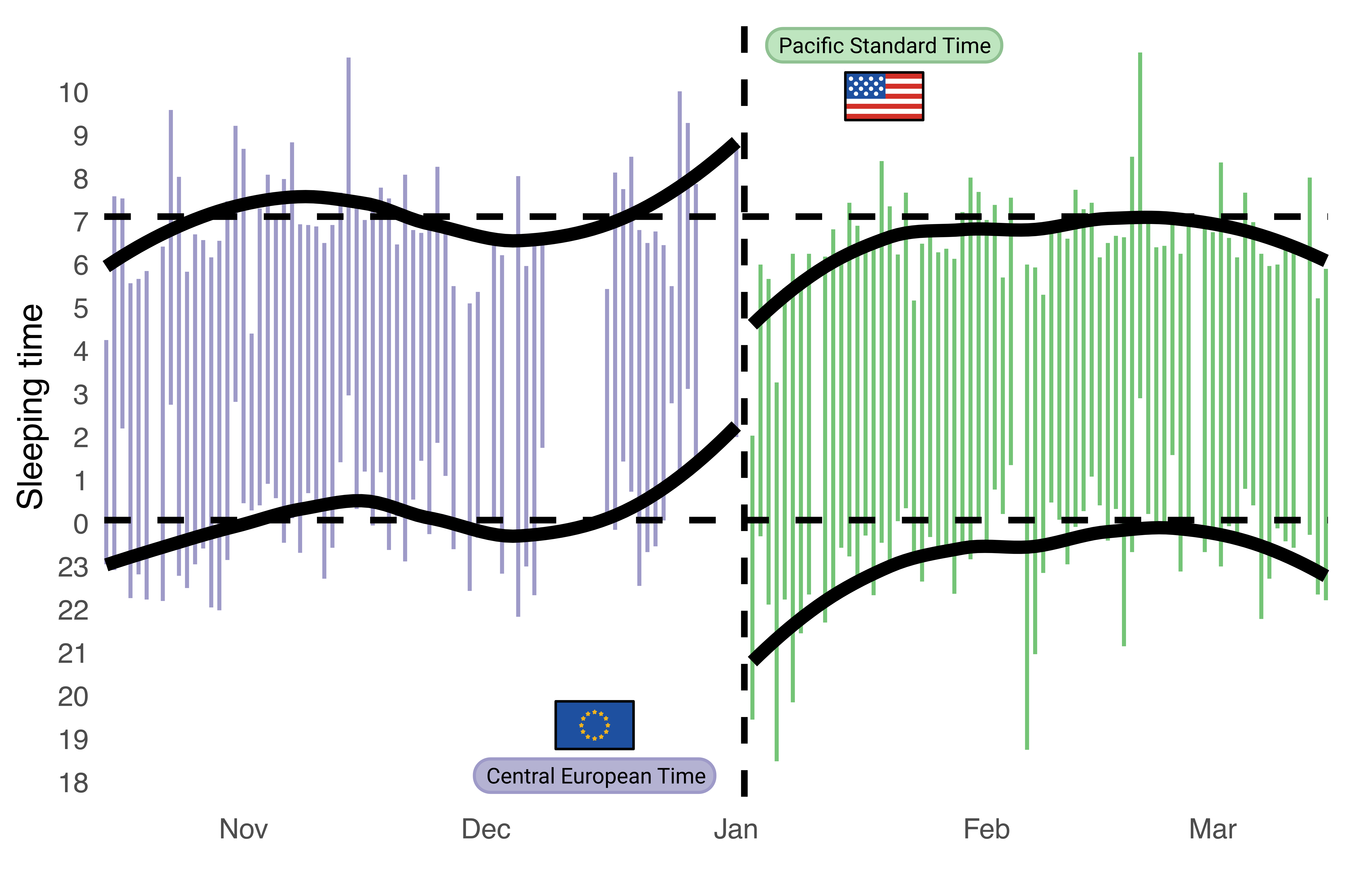
Indeed, it was quite noticeable to see the change in the time when I went to bed (bottom) of the graph and also the time when I woke up. Surprisingly, overall I would say the cumulative asleep time was similar, but I found it interesting to track that after a couple of weeks I was completely back to my normal schedule.
The details
This is a ggplot based visualization with rectangles representing the start to end sleep sessions every day. In the X axis, each rectangle represents one night with a missing spot for when the data was missing (I sometimes forget to charge my band).
The black lines represent the trend lines, computed with geom_smooth and a span of 0.8 to get a more curvy representation. You can also see how I completely split the data in two groups so instead of one consistent trend line there are two. Although this might be considered a bit of cheating, the reason I think was justified as I wanted to show clearly how my pattern changed once I got into the US.
I also added some horizontal lines indicating my “average“ go-to-sleep and wake-up time, which were surprisingly concordant in both regions. It’s nice to see that in average I am sleeping 7 hours, which I just learned is the recommended (by the CDC) amount of sleep an adult person should get.
If you are interested to get your sleeping profile, the data was extracted directly from the MiFit app (now Zepp Life) by digging into the settings in the data privacy section (it’s a bit hidden but is a fun trip). The code of my visualization is public in my GitHub site here, but I recommend playing with the data a bit, as my current set up is specific to my use case.
I hope you found my data interesting, and you might visit my site in the future!